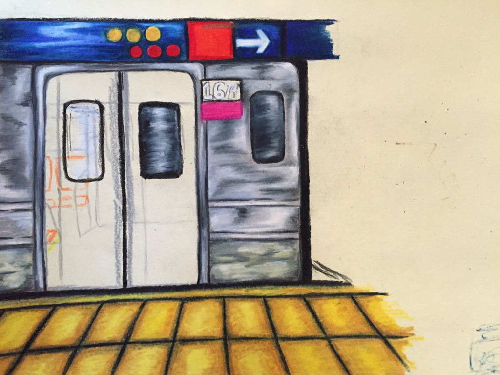
for my second concentration I was in between doing the interior of a bus and a subway station. I chose colored pencil because I was pressed for time and colored pencil is something I can work on at home and usually seem to knock out fast. in retrospect I actually would've preferred to do this piece on oil because the texture of the metal on the train was really hard to achieve. I think I should've made the shadows and highlights larger and less sporadic throughout the train because it gives it too much movement. I really like the colors in this piece though I found a reference photo that struck my interest because of the bright yellow tiles it had in it and decided to contrast it with a blue indigo direction sign instead of black. the pink and the red also af too the color scheme and I think it works really well. as you can see I was originally going to draw the inside of the train but I felt like I would've lost a lot of detail and it would've turned out elementary so I decided to do the doors closed. it looks crooked but I swear it's just the picture. I'm hoping to go back with a gel pen and add bright white highlights and blend a little more.
 RSS Feed
