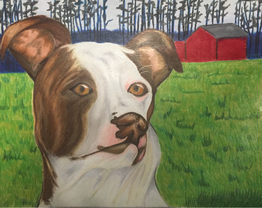
|
I definitely started this class thinking art was any and everything I wanted to do. But everything is subject to change. Before taking this class I thought art was about the only thing I was good at, the only thing that made me, me. But as the year went on I hit a lull in my creativity and wasn't very proud of the things I was creating. Don't get me wrong there's some things I've been very proud to have created but there's some I haven't been proud to call mine. Although this may sound a little disheartening it was actually a very freeing experience for me to realize I was more than the art I make. I became able to discover who I was outside of art and not feel like my being depended on my ability to create.
This year has definitely been a roller coaster for me. I think senior year is that way for everyone. I'm definitely a tough pill to swallow and I don't rub everyone the right way but I'm glad Mrs rossi was willing to put up with me for a full year. How I act is no reflection of my teacher but rather myself and outstanding circumstances. I'm just glad to have had such patient teachers this year. I'm excited to see where creating takes me without it dictating my life. 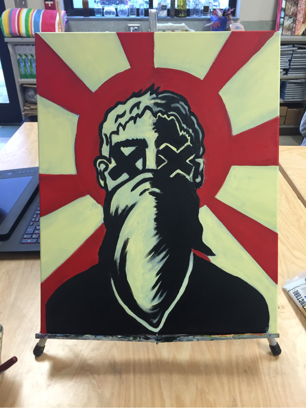 for my fifth concentration I did a piece on organized crime um this piece made me really happy because I kinda just got to let go of trying to do everything and balance color and I kinda just got to let go and experience color blocking which was fun and different. I also got to fight Mrs rossi on it and j was right which was cool but other than that I'm really happy with it and if I was to go back and change it I would probably make the colors more opaque to where you couldn't see the wash through it and I'd add a print to the bandana and paint the edges but overall I'm very happy with the composition and the color combinations because I feel like the compliment each other really well and it's really bold.
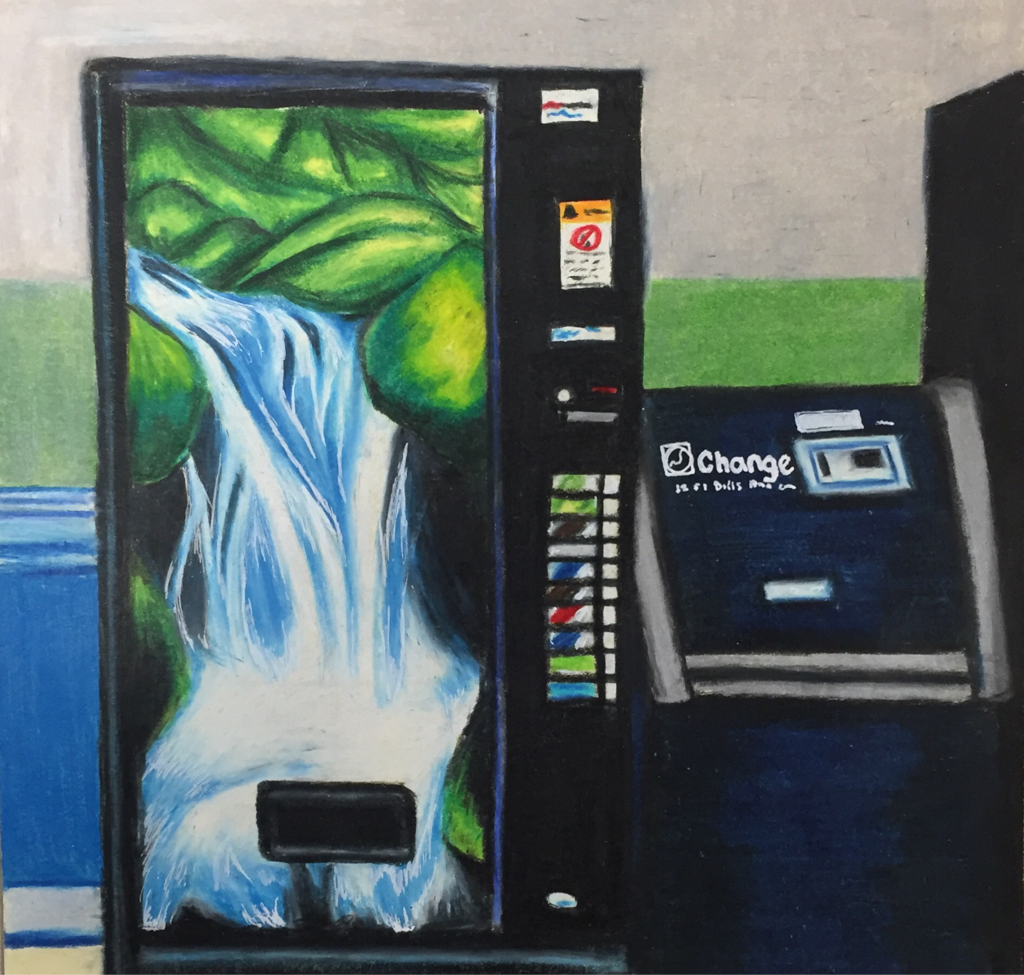
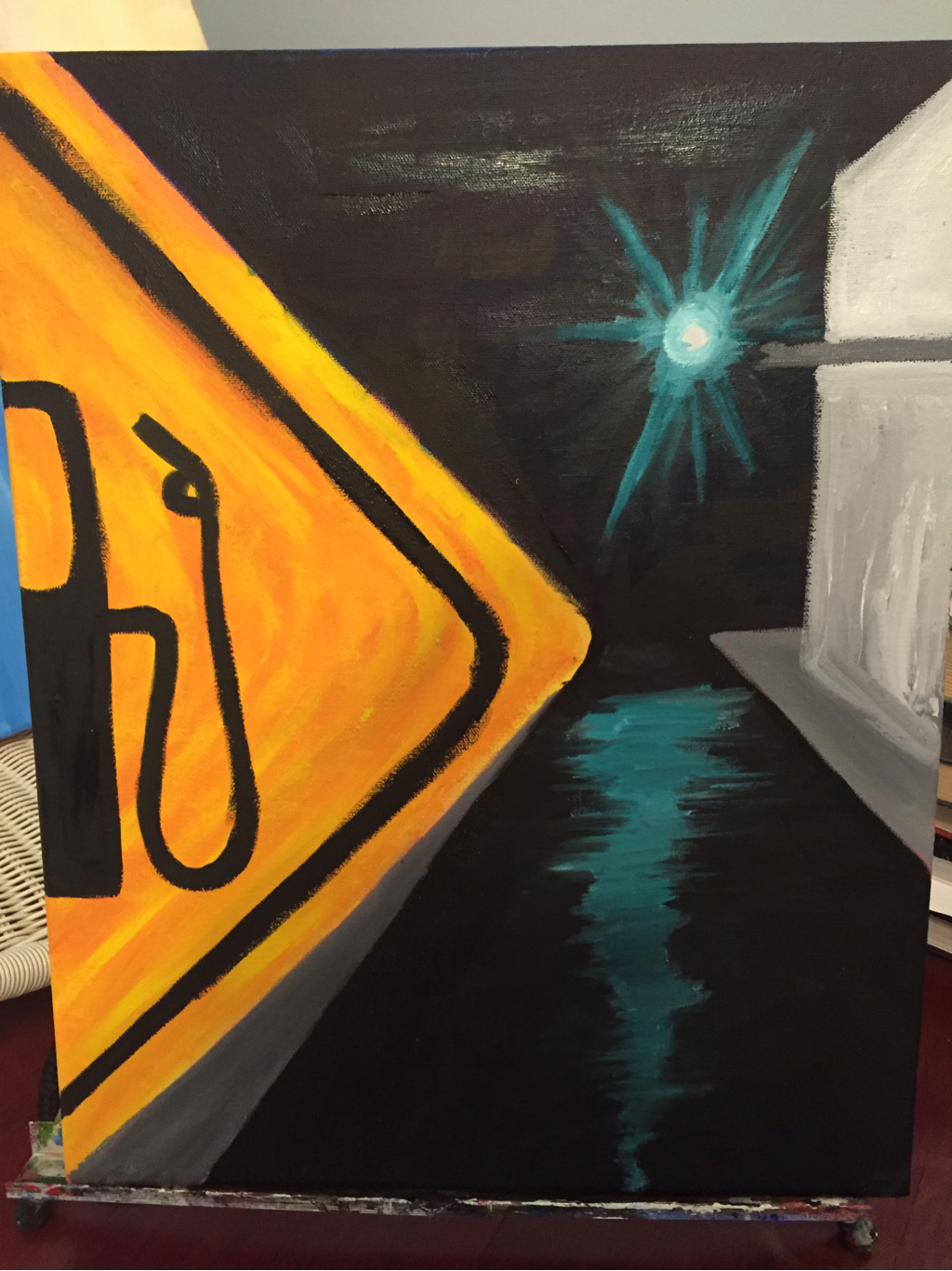 so I don't have pictures for my 4th conversation since I'm still finishing up parts of it and it's still technically in progress but I'll have it up here in a fat minute so don't worry. I chose to do a street view with a gas sign up close taking up most of the composition. at first I started off by doing a scene in the day time at which point I decided it looked too scenic and didn't really represent the urbanization concentration. then as I was driving home one day it was raining and I started looking at the reflections of stop lights in the Puddles on the streets and idk if that counts as distracted driving but I'm still here and it gave me an idea. so I took the reflection and but it in the street part of my painting I them made the stoplight out of focus and blacked out the sky. to finish I'm hoping to add some buildings to the side of the street to make it seem like it's in a city and add some more depth to the painting and that's about all I need to finish I've just been procrastinating because I'm so lazy to use oils.
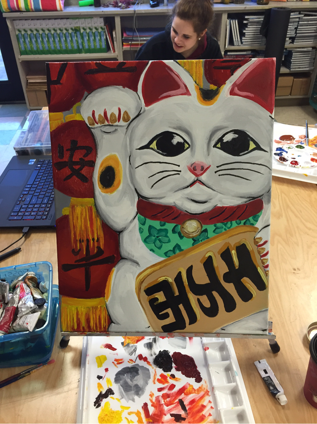 okay so I think I accidentally deleted the in progress photos while cleaning extra photos off my phone but I have this one. I chose to do this concentration because when I think of urban living I think of take out and one of the most common things you find in Chinese takeout restaurants is a lucky cat. I chose to do a close up composition of the cat because I really wanted to get the detail in and I lose detail when I go smaller. I knew that I definitely wanted to do red in the background with a more abstract pattern and I feel like I made a really good choice by doing the lanterns because it carried the red from the cats collar into the rest of the painting I'm also glad I added the lettering because the lettering of the piece the cat is holding is so dark and bold and it also helped carry your eye through the painting to have other letters. if I were to go back and do it again I'd probably explore with some more color in the cat and make the face more proportional to the regular cat statues. overall liked making this piece I think it's a cute painting which I usually don't do but it's a cute painting in a me way and I think it's really cool to discover my own style the more I create.
i don't have a picture of my landscape yet but it is soon to come. for my landscape I originally started a small acrylic painting of a street view but grew frustrated. I abandoned that idea and decided to completely restart. I chose a small oil painting with a photo mrs rossi had taken of a flower bush inside a Savannah graveyard. the bright colors in contrast to the full granite and ground surrounding it really drew me to it. unfortunately it is oil so it is still in progress due to the unessecarily long amount of time it takes oil to dry. I'm hoping to add more depth and really focus on the flowers and play with color a bit more than it is in the painting. the green of the leaves and the pink of the flowers I really want a lot of colors in. I also really wanna focus on the texture of the ground as well because that was something I previously struggled with in my other landscape. I'm also hoping to put a lot of lines and texture in the branches. it's going to be a challenge to go this small because I usually don't perform as well when I paint smaller but I really want to challenge myself because I feel like I'm not growing as well as I should be because everyone around me is growing so rapidly. I hope to challenge myself and grow to the best of my ability.
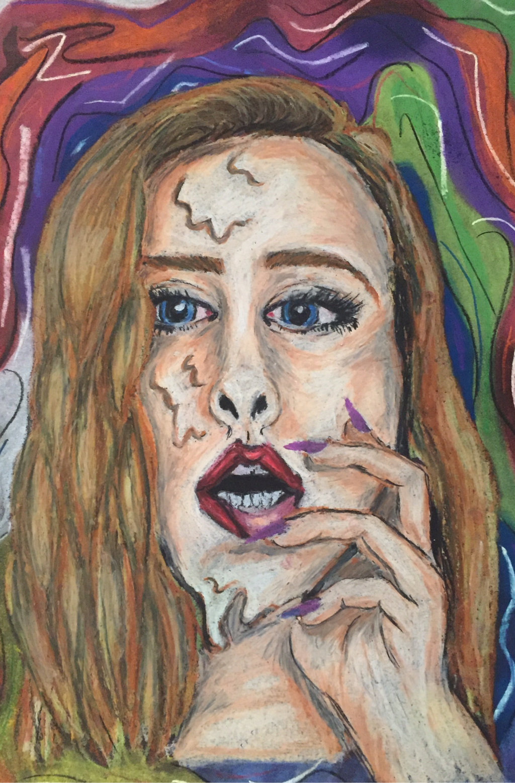
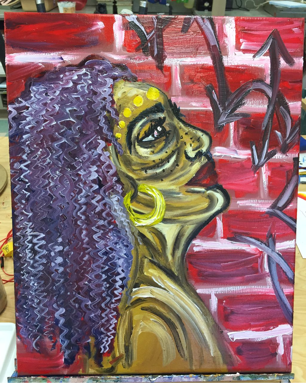 so for my first concentration piece I decided to do a piece about Afro punk which to me is one of the most interesting and bright urban festivals that takes place. I really wanted to channel the amazing different types of hair and representations of urban culture in fashion while still producing in my own style. I'm not much of a realistic painter and I realized that while trying to blend skin tones and create a realistic facial structure. as I grew more frustrated I decided to lay the highlights and contours of the face more dramatically I like the way they looked so I decided to leave them. one of the main characteristics of Afro punk is bright natural hair but with oils a bright magenta would be hard to manage. to compliment the red brick I landed on a purple and decided to carry that purple into the rest of the painting by putting hints of it in the brick. the brick then looked too plain and my eyes were too drawn to the left side rather than the whole painting so I decided to add some cut off graffiti. if it was too black and bold it would've taken away from the central focus so I decided to tone it down with little hints of white and red. if I were to go back I would define the lips more and add darker shadows into the hair to add more depth.
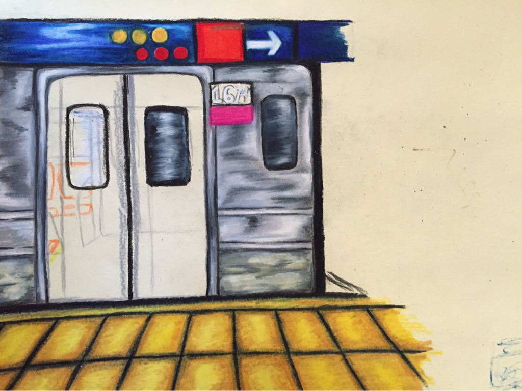 for my second concentration I was in between doing the interior of a bus and a subway station. I chose colored pencil because I was pressed for time and colored pencil is something I can work on at home and usually seem to knock out fast. in retrospect I actually would've preferred to do this piece on oil because the texture of the metal on the train was really hard to achieve. I think I should've made the shadows and highlights larger and less sporadic throughout the train because it gives it too much movement. I really like the colors in this piece though I found a reference photo that struck my interest because of the bright yellow tiles it had in it and decided to contrast it with a blue indigo direction sign instead of black. the pink and the red also af too the color scheme and I think it works really well. as you can see I was originally going to draw the inside of the train but I felt like I would've lost a lot of detail and it would've turned out elementary so I decided to do the doors closed. it looks crooked but I swear it's just the picture. I'm hoping to go back with a gel pen and add bright white highlights and blend a little more.
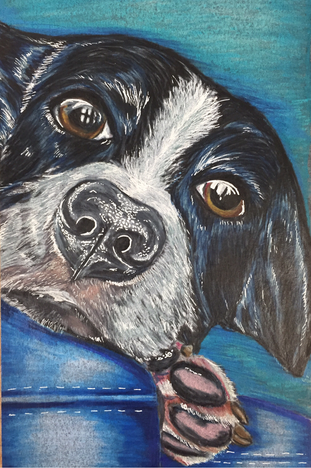 So originally I started off doing an oil painting of my dog but later abandoned it because my dogs fur has so much texture and that's not something I've been able to achieve with oil paints. so I decided to do a drawing of my friends dog roscoe because he's the only dog other than my own and da Vinci that is the biggest ham I know. I love this dog yo. but I'm really happy with this drawing my favorite parts are his paw and the pinkish area right under his nose. if I was to re do this id probably choose a different background because the light colors just didn't really work well with the black paper but overall I'm really happy with this and my friends mom made it her phone background which is really cute so I plan on giving her this when my portfolio is finished and I know I'm not supposed to give art away but this is way more important to her than it is to me so yolo.
|
Authorabout you. ArchivesCategories |
 RSS Feed
